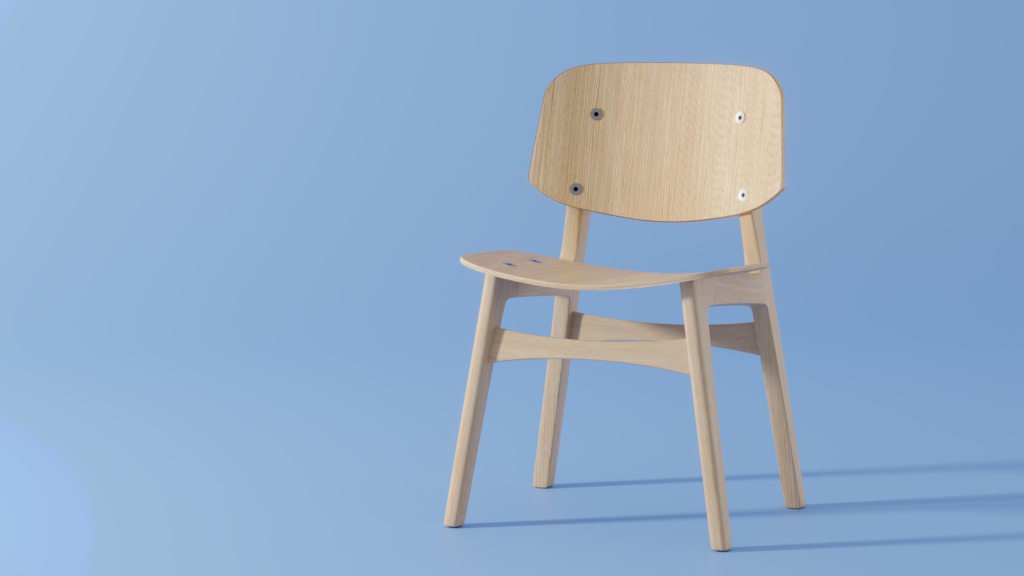
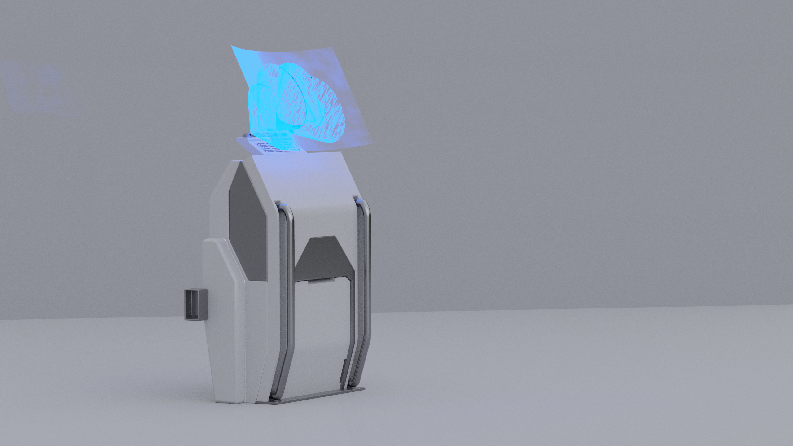
Yeah. I am going to be working on tutorials and courses for a while yet. The Engineering Deck seemed complex, so I thought I would take a break and work on a chair tutorial. Something that could be thrown into a scene and look photo realistic and, I thought, would be relatively quick and easy with my new skills!
Ha. No.
Not that the chair tutorial was hard. It was about the same as everything else I have done to date. Slow, picky and requiring me to slowly piece together mistakes and review steps to see what obvious things I had missed.
However, this also was a completely different workflow for modelling than the previous pieces. The pickiness of working to reference images in orthographic (axis based views without perspective distortion) was a new thing for me. The choices this author made in how to do certain things were different, and I have enough practice now, I can look at something and think “I could do this same thing the other way” and have some limited ability to assess whether that is better or not.
The screws for instance, are poorly done in the tutorial. A boolean operation to create a slice in the model would have created another surface, or pair of surfaces that could then have been textured but wouldn’t have required complicated placement and poor results.
There are some other elements that could also be done differently. Would they be better? I doubt it, although I think using a bend on a plane would have been an easier way to match up the seat and seat back than dragging around vertices, but I think the end result is the same.


